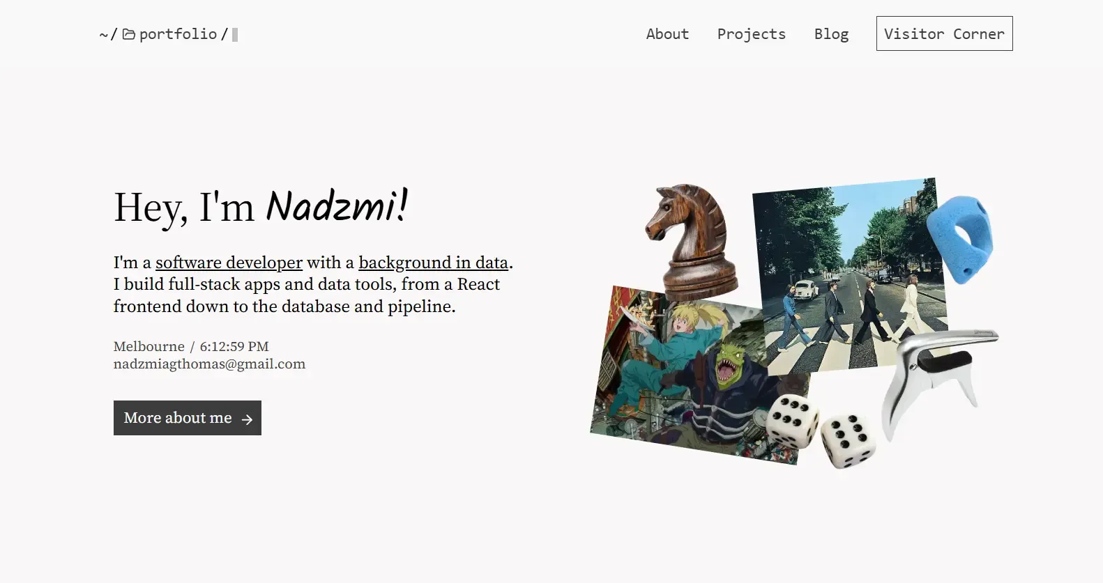
Overview
This portfolio started as a challenge to myself. Most personal sites that I see online follow the same pattern: rounded corners, floating cards, and smooth gradients. And this has become more prominent with the advent of vibe-coding. I do believe that they look friendly and approachable, however there’s no boldness to it. Therefore, I wanted build something that felt sharper and more striking.
This whole portfolio is built using Astro and MDX. Astro lets me use whatever framework I want for interactive parts (React for the tooltip, guestbook, and header) while keeping the rest as static HTML. MDX means I can write case studies like this one as markdown with embedded components, which keeps things flexible without overcomplicating the setup.
Design Philosophy
Rounded corners are not inherently bad. They soften the UI and make it more approachable. But they have become the default to the point where using them feels like following a template. On the other hand, sharp corners are often subconsciously perceived as dangerous and unfriendly. They are also harder to pull off because every alignment issue, every spacing misstep, is more visible. Personally, I like sharp corner more as they tend to draw more attention, which, if used correctly can create visually striking design.
I also wanted to mix editorial and software-themed design. Editorial in the layout and typography: clean grid, intentional whitespace, serif body text. Software-themed in the details: the terminal-style breadcrumb navigation, the hand-drawn guestbook elements, the collage on the landing page.
Navigation & Breadcrumb

The navigation uses a directory-style breadcrumb that looks like a terminal path: ~ / portfolio / project / project_title.
Each segment is clickable except the current one, and clicking them would navigate to that page directory.
At the end of the path, there is a blinking square that mimics a terminal cursor. It is a small detail, but it sets the tone for the whole site.
The breadcrumb updates across page transitions using Astro’s view transitions. Clicking a link does a soft navigation, and the breadcrumb changes to reflect the new path. The header also changes background color based on the section’s color scheme, creating a seamless transition between pages.
Cursor Tooltip
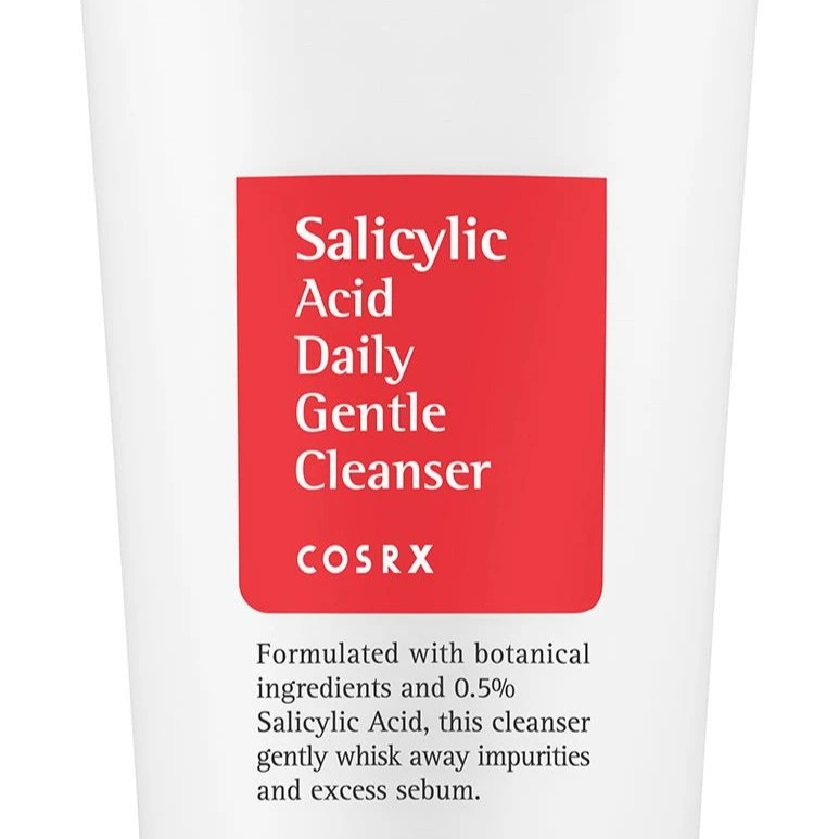
Tooltip inspiration
This cleanser is quite good in my opinion. The color red also remind me of KFC!
Tooltip implementation
The tooltip was inspired by the COSRX Salicylic Acid Daily Gentle Cleanser. I liked how the combination of white text inside red box gives a very striking appearance. The tooltip follows the cursor smoothly using linear interpolation with a 0.15 lerp factor. It is not rigid, it lags behind just enough to feel natural.
I also make sure that the tooltip only activates on devices with hover capability (checked via matchMedia),
so mobile users do not get a broken experience when clicking around.
On the landing page collage, each item has a tooltip that gives a little context about why that object is there.
Landing Page
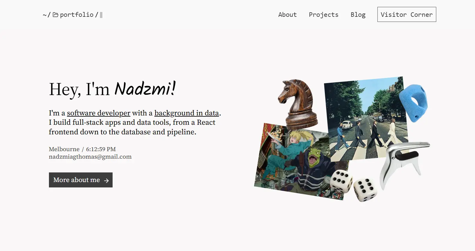
The landing page is split into two halves. The left side has basic information. The right side has a collage of objects that give a glimpse into my personal life: a chess knight to represent my love for chess, the Abbey Road album cover to showcase my love for music (especially older music), a bouldering hold to show my recent obsession with climbing, a guitar capo for my tendency to play guitar between my study session, a Dorohedoro banner to represent my nerdiness in consuming media, and a pair of dice (I LOVE GAMBLING!! This is a joke!!!!).
The collage is not just decoration. It personalise the first impression beyond the usual background information and the hero image. Each item has a tooltip explaining its significance.
About Me
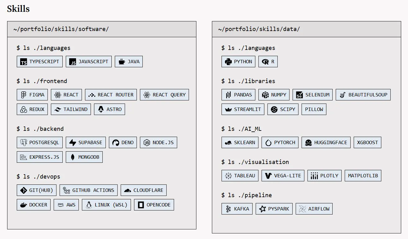
The about page follows the same split layout as the landing page but replaces the collage with a photo of me. Below that, there are education and certification sections, and finally the skills section.
Skills are displayed inside a terminal-themed container.
Each category (software and data) shows a $ ls ./skills/{category} command followed by the skill chips.
Each chip has an icon and tooltip with context about my experience with the tool.
It is a fun way to present a boring section.
Projects & Case Studies
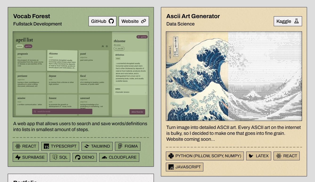
I want to design the project cards so they look like polaroid picture.
I layer the card with paper texture using CSS mix-blend-mode: multiply to give it a physical feel.
Clicking a card opens the case study page, which matches the card’s background color. This creates a visual connection between the card and its full case study. The color is automatically lightened by 10% for the case study background as I found it way easier to read the text that way.
Blogs
I have always wanted to write a blog. Not for an audience, but for myself. Learning how to become a better writer has always been one of my goals in life. I intend to write about chess, coding projects, and CTF competition writeups. The blog section uses pagination grouped by year. Each post has tags and a featured image displayed on the listing page.
Visitor Corner
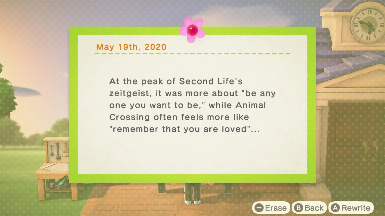
Animal Crossing bulletin board (inspiration)
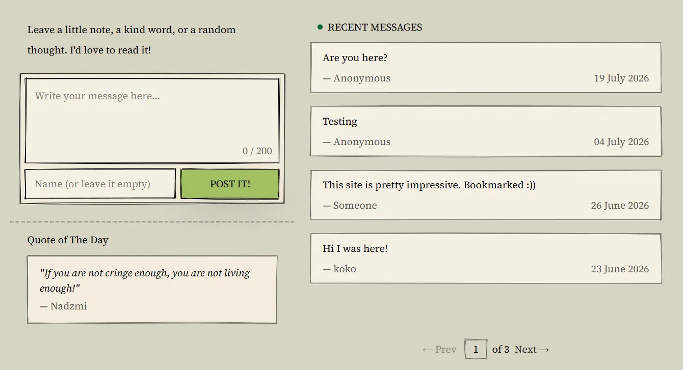
The message board (incomplete implementation)
Initally, I wanted to create a visitor corner as a playground for visitors. I wanted to showcase components that user can interact and play around with. However, I feel like it was a bit too much, so I decided to just focus on message board.
The design was inspired by the bulletin board in Animal Crossing New Horizons. I used roughjs to give the components a hand-drawn feel and sketch-like appearances. The message cards, pagination buttons, and the quote-of-the-day box all have slightly irregular borders that look drawn with a pen. I’m planning on adding various stickers to the message board to give it more life.
The message board connects to Supabase for storage and uses a edge function and Gemini for moderation. I don’t want people to leave troll comments, because I know my friends would do that :))
Moderation Pipeline
Every message goes through a multi-layered moderation pipeline before appearing on the site:
- Rate limiting: Max 3 messages per IP per hour using SHA-256 hashed IPs
- Honeypot: A hidden website field to trap automated bots
- Rule-based checks: Message length (3-200 characters), name length (max 30), URL detection, repeated characters, repeated words, and spam keyword filtering
- AI moderation: Messages that pass rule checks are sent to Gemini 2.5 Flash Lite. I chose this model because it is the fastest at processing short text. Latency matters when someone is waiting for their message to appear. The model classifies each message as approved, pending, or rejected
On the frontend, messages use optimistic updates. When you submit a message, it appears immediately in the list before the server even responds. If moderation rejects it, the message gets removed. This makes the experience feel instant.
404 Page

The 404 page is one of my favourite parts.
It uses a ‘The Matrix’ inspired terminal simulation that fills the entire viewport.
It has scanlines, glitch effects, chromatic aberration, mouse-reactive distortion, and a full page load animation.
The colour is tinted green (#A7EF9E) to give it that old CRT terminal look.
I used the react-bits library to build it.
It was honestly more effort than the page deserves, but I think it looks very cool.
If someone lands on a broken link, at least they get something fun to look at (click here to check it out).
SEO & Discoverability
I bought the domain nadzmi.dev because it sounds cooler than the GitHub Pages link nadzmi27.github.io/portfolio/.
Having a clean custom domain was the first step I took in making the site discoverable.
Then I added structured data via JSON-LD Person schema that links to my GitHub, LinkedIn, Kaggle, FIDE chess profile, and other profiles. This informts search engines that all these accounts belong to Me, which helps associate the portfolio with my name.
To further improve the SEO, I also inlcuded a sitemap generated by @astrojs/sitemap, a robots.txt pointing crawlers to it, canonical URLs on every page to prevent duplicate content issues, an Open Graph and Twitter Card tags for social previews.
The meta description and title were also rewritten to include my full name rather than just a generic label.
I also set up Google Search Console to submit the sitemap and monitor indexing.
Key Learnings & What’s Next
Building this portfolio taught me that constraints force better decisions. Limiting myself to square corners meant every layout choice had to be precise. Using a fixed colour palette made me think harder about contrast and hierarchy.
There are inconsistencies I want to clean up. Some sections use different formatting and spacing. The project filtering on the projects page works but feels rough. The blog only has placeholder posts right now. The mobile experience also needs a lot of attention as I’ve been mainly focusing on desktop view.
I plan to keep iterating. Add more projects, write actual blog posts, and make the experience tighter overall. But for now, it does what I need it to do. It shows who I am and what I build.