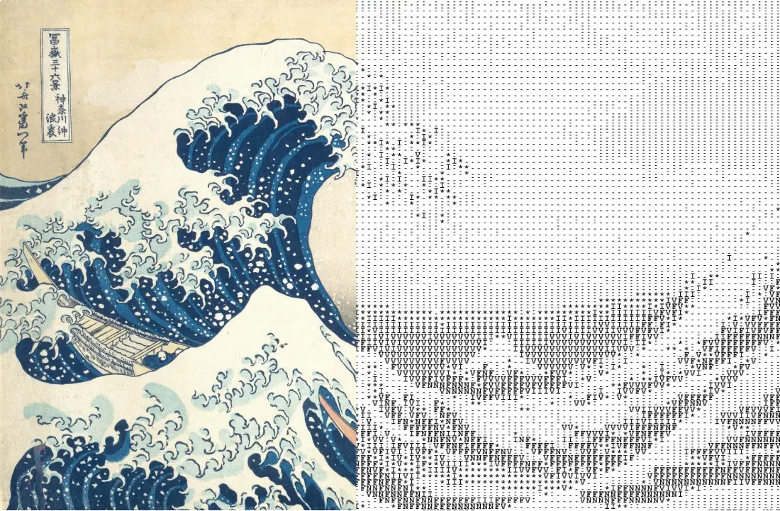
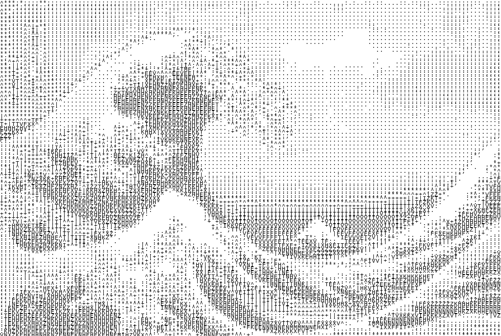
The Great Wave off Kanagawa rendered as ASCII art
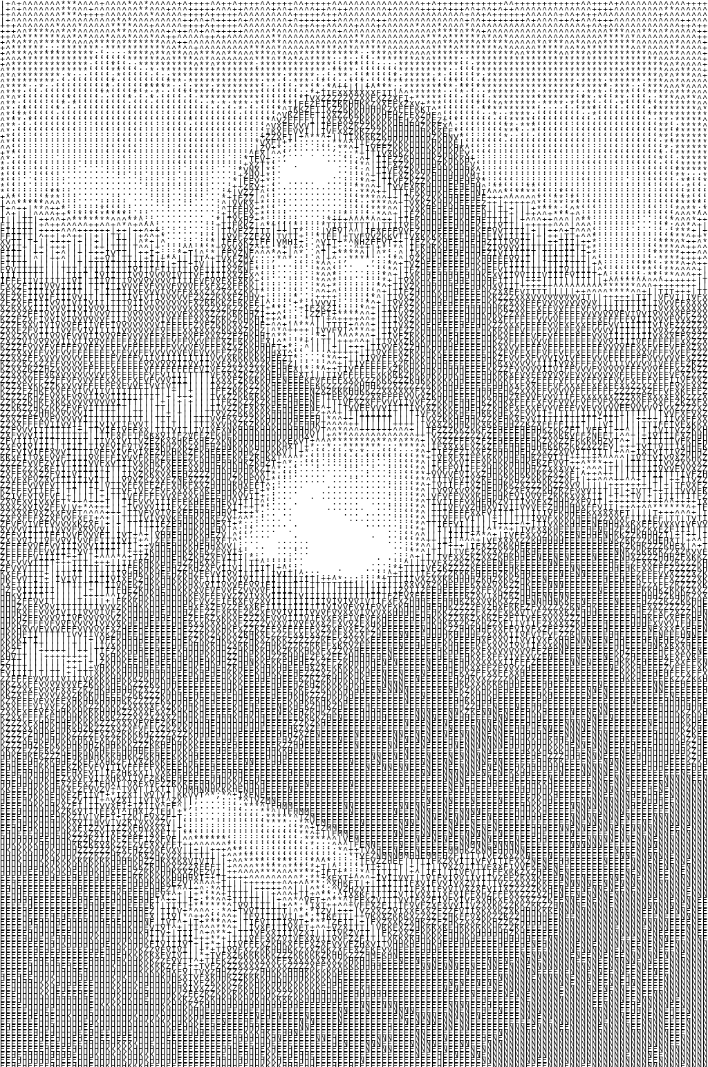
Mona Lisa rendered as ASCII art
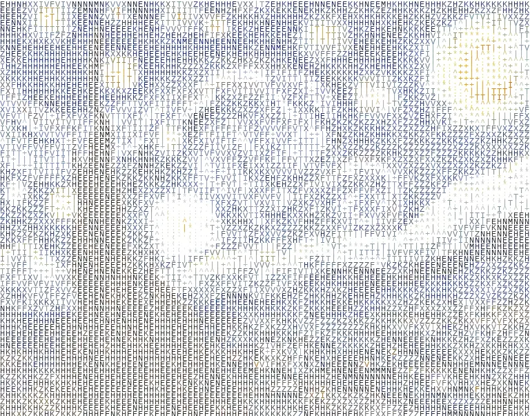
Starry Night rendered as ASCII art (with color)
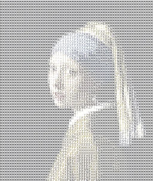
Girl with a Pearl Earring rendered as ASCII art (with color)
Some of the ASCII outputs generated from various artworks: The Great Wave off Kanagawa, Mona Lisa, Starry Night, and Girl with a Pearl Earring. Open image in new tab to zoom in and see the ascii characters in detail.
Background
Most ASCII art generators I find online are bulky. They use a small grid and lose a lot of detail. I wanted to build something that goes into fine grain, something where you can crank the resolution up to 512 characters per row and still being able to zoom in to see the characters.
This project explores three approaches to converting images to ASCII art: brightness-based mapping, a hybrid that mixes brightness with edge orientation, and a lineart method that uses template matching with font-rendered characters. I also built an interactive widget so I could tweak parameters on the fly without re-running code.
Optionally, each character can be rendered in its original pixel color instead of pure black. I’ll epxand more on that below.
All code is on (Kaggle). and I’m planning on a React web version so anyone can try it out.
Pipeline Overview
Character selection is driven entirely by grayscale brightness. The original image gets converted to greyscale using the standard formula:
Y = 0.299R + 0.587G + 0.114BGreen is weighted heaviest because human eyes are most sensitive to it.
Once the brightness grid is built, each cell maps to a character. If color mode is on, there is a second parallel path, in which, the original RGB image is resized to the same grid dimensions, and each cell’s average RGB is sampled and used as the ink color at render time.
Original image
  ├──→ grayscale → resize to grid → brightness → character grid
  └──→ original RGB → resize to grid → per-cell color samples
                                         └──→ optional: paint each character in sampled color
The grid dimensions aren’t randomly selected. Characters in a monospace font are taller than wide, so an aspect-ratio correction is applied:
num_rows = floor(num_chars × (orig_h / orig_w) × (char_w / char_h))The final step renders the character grid at high resolution using a monospace font, then downscales. At high character counts the individual letters blur into texture, which can make the characters seems invisible. But upon zooming in, the characters should be visible, and this was intentional.
Brightness-Based Method
This is the classic approach. Each pixel’s luminance maps directly to a character where dark areas get dense characters, and bright areas get sparse ones.
Quantization
The grayscale pixel value is normalised, optionally gamma-corrected, then inverted to get darkness:
d = 1 − (p / 255)^γLinear quantizes darkness into equal-width bins, one per character:
i = min(floor(d × |char_set|), |char_set| − 1)
character = char_set[i]
Adaptive applies min-max normalisation first, so the full character range is always used even on low-contrast images:
d_norm = (d − d_min) / (d_max − d_min + ε)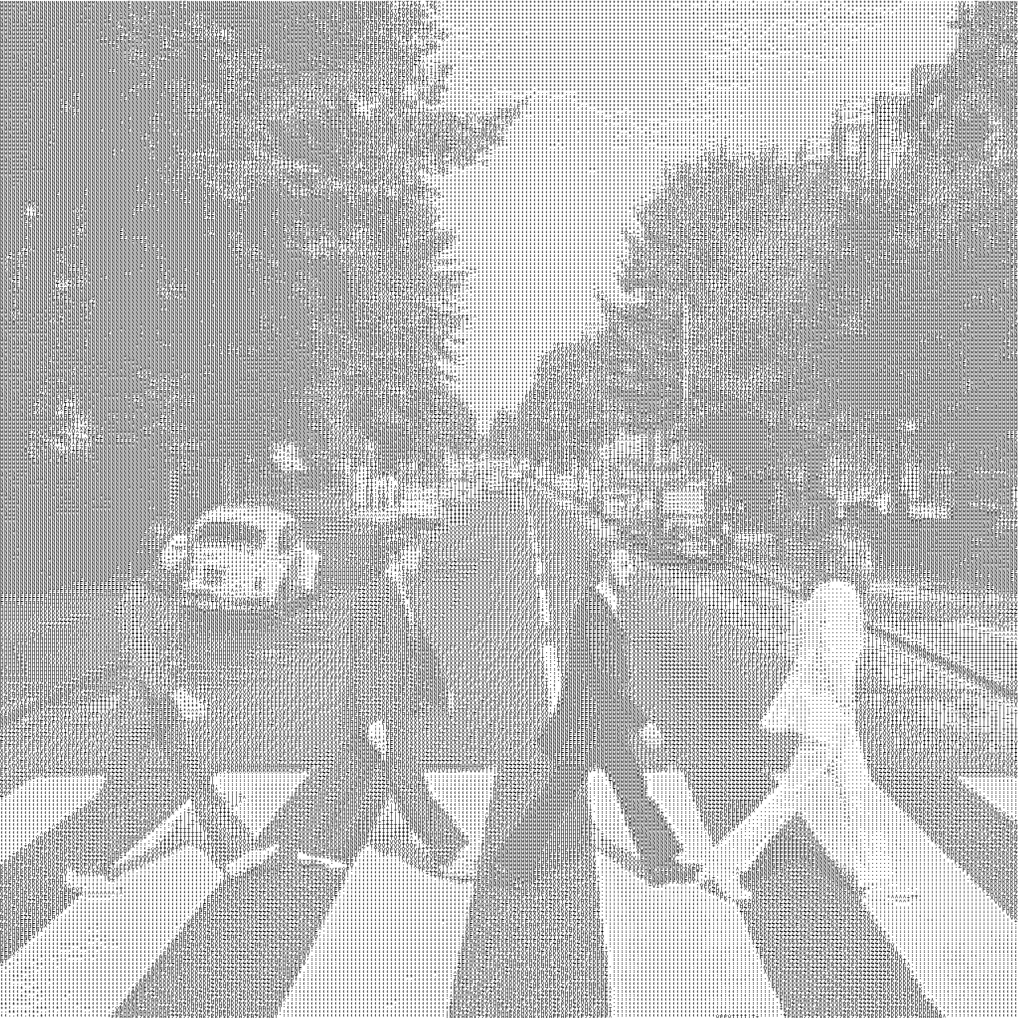
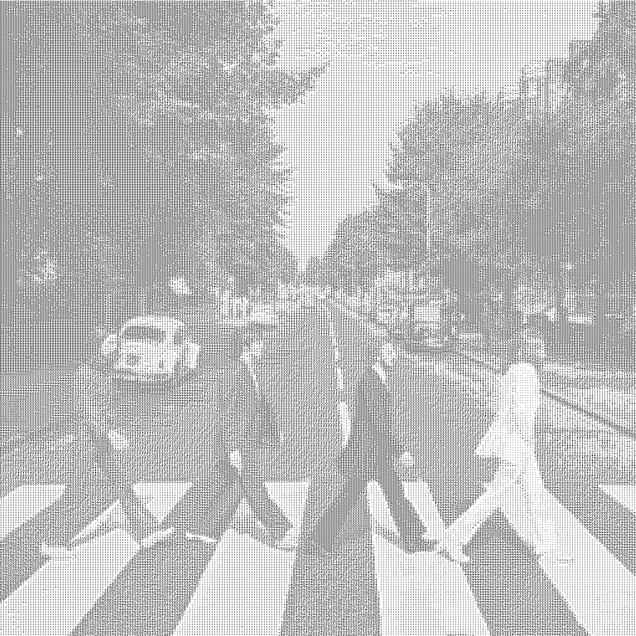
Linear vs Adaptive. Notice how adaptive makes better use of the character range (though linear could look better due to less range being used).
Character Set Sorting
Instead of manually ordering characters by perceived brightness, I followed the approach from Parberry (2011) and measured actual ink coverage. Each character is rendered onto a canvas, and the fraction of inked pixels determines its rank:
coverage(c) = 1 − (1 / hw) × Σ(I_c(x, y) / 255)This gave me empirically sorted character sets, eliminating manual guesswork.
The custom2 set I settled on was .:;*^+|TIVFXZKHENMW as it seems to be giving the best visual.
Parameters
- Gamma correction: exponential tonal shift (γ < 1 = lighter, γ > 1 = darker)
- Blank threshold: pixels above this brightness are always mapped to space (keeps backgrounds clean)
- Font size: smaller = finer grid = more detail
- Number of characters per row: 32, 64, 128, 256, 512. More = finer texture
- Color (optional): when enabled, each character inherits the original pixel’s RGB color instead of rendering in black
Hybrid Method
Pure brightness-based mapping loses structural information. Edges and contours get muddled. The hybrid method addresses this by overlaying edge orientation on top of brightness.
The idea: for pixels where the Sobel or Canny edge detector finds a strong edge, replace the brightness character with an orientation-specific one (like /, \, |, -) that follows the direction of the edge.
This gives the best of both worlds. Tonal depth from brightness, structural clarity from edges.
Lineart Method
This is the most experimental approach. Instead of mapping pixels to characters, it converts the image into lineart using Sobel or Canny edge detection, then matches edge patterns against a library of font-rendered character templates using 2D convolution (scipy.ndimage.convolve).
Each character is rendered at the target font size, and its pixel grid becomes a template K. The convolution score at each position determines the best match:
(I ∗ K)(x, y) = Σᵢ Σⱼ I(x − i, y − j) K(i, j)The shapes character set (. -=+|/\\<>^v[]{}()*#@) works best here. The characters are structurally distinct, so template matching can actually tell them apart.
What’s Next
I’m planning to build a React web app that wraps this pipeline so anyone can upload an image, tweak parameters, and download their ASCII art without touching a single line of Python.